Just a month ago Mozilla gave us the final version of Firefox 3.5 giving us a lot of nifty features like HTML5, private browsing, smarter session control among others. But Mozilla aren’t the kind of people who sit on their laurels, they already posted screenshots of Firefox 3.7 a week ago, and today we have Mozilla Firefox 4.0 screenshots!
Unfortunately the screenshots are for Windows, none for Linux yet. Also, they warned that these are just a draft for exploration and/or brainstorming.
Basically they are pondering two GUI changes. Tabs location and a combo Stop/Refresh/Go Button.
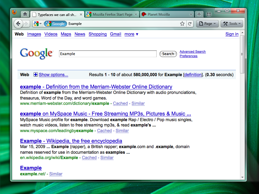
Tabs Location: Top or Bottom?
Should tabs be “Tabs-on-Bottom,” or the current setting
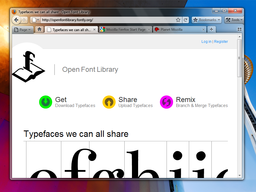
Or should they be “Tab-on-Top”, or à la Google Chrome
Positives
- Save Vertical Space
- Efficiency/Remove Visual Complexity – Right now the tabs have to be connected to something. So we are adding an extra visual element for them to connect to.
- Shorter Mouse Distance to Page Controls
Negatives
- Breaks Consistency/Familiarity – Moving things confuses existing users.
- Title is MIA – With the space removed from the titlebar you only get the truncated version in the tab.
- Longer Mouse Distance to Tabs – Takes longer to mouse to a tab.
- Lost Space – Sandwiched in between the application icon and the window widgets you lose some space.
Personally, I am not a fan of this implementation. The MIA title problem really does irk me. However, why not leave both options for users? Any thoughts?
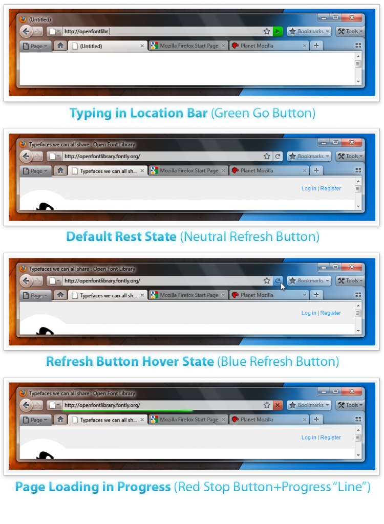
Combo Stop/Refresh/Go Button
This one seems pretty logical. Why have separate stop, refresh, and go buttons? If you are typing a url, the button will change into a green go button, while its loading that same button would change into a red stop **button, and once a page is fully loaded the button changes into a **regular refresh button.
Remember, these are just proposed, and like any Open Source project, the feedback from the community plays a big role in the final product.
Positives
- Save Vertical Space
- Efficiency/Remove Visual Complexity – Right now the tabs have to be connected to something. So we are adding an extra visual element for them to connect to.
- Shorter Mouse Distance to Page Controls
Negatives
- Breaks Consistency/Familiarity – Moving things confuses existing users.
- Title is MIA – With the space removed from the titlebar you only get the truncated version in the tab.
- Longer Mouse Distance to Tabs – Takes longer to mouse to a tab.
- Lost Space – Sandwiched in between the application icon and the window widgets you lose some space.